Saturday, September 29, 2018
Thursday, September 27, 2018
Tuesday, September 25, 2018
Sunday, September 23, 2018
Friday, September 21, 2018
Wednesday, September 19, 2018
Monday, September 17, 2018
Saturday, September 15, 2018
Thursday, September 13, 2018
Tuesday, September 11, 2018
Sunday, September 9, 2018
Friday, September 7, 2018
Wednesday, September 5, 2018
Monday, September 3, 2018
DragonCon: 1998 vs. 2018
Dragon Con 1998 wasn’t my first convention. I had previously
attended Dragon Cons ’95 and ’97. Dragon Con 1998 wasn’t my last convention.
However it does hold a special place in my heart.
If I back track just a little bit, Dragon Con 1995 was my
very first comic book convention. I attended as an aspiring sixteen year old
comic book artist. I brought HORRIBLE sample pages to the convention. I knew enough
to bring pages that showed sequential storytelling so I brought ONE page for
every prospective publisher. I gleamed what advice I got and put that knowledge
to my next set of pages. I took the following year off due to the 1996 Summer
Olympics. I brought a new batch of comic book pages to Dragon Con 1997 and
learned more ways to improve my art. I applied every lesson taught to me,
thinking that each one was the last thing I needed to master; facial consistency,
anatomy, line weight and its effect on visual unity, perspective, storytelling,
set-up and pay-off. If someone told me everything I sucked at in 1995, I
probably would have decided to do something else with my life. Through the
perspective of history, Dragon Con 1998 was kind of a turning point in my life.
By the summer of 1998, I had just finished my second
semester of college. I was in a very melancholy mood. My paternal grandparents
had passed away that semester and school has NEVER been something I looked
forward to. I was in love with the idea of being an aspiring comic book artist.
Unfortunately without a writer, I didn’t really have anything to draw. I had a dead-end
job at a movie theater that but I did like my coworkers. One coworker in
particular, Dwain Currier, was as obsessed with Indiana Jones as much as I was.
We kind of fed each other’s obsession. In 1996 we made an Indiana Jones fan film. Dwain provided storytelling input and starred as the titular action hero.
I played the part of storyboard artist and director (and evil mechanic)! The following summer, we made a James Bond fan film, and the subsequent fall, decided to make another one. These projects were
fun distractions; exercises in storytelling while making both movies and memories.
We had just completed our second James Bond short (Yesterday Always Lives)and I was
eager to get to Dragon Con ’98 and submit it in their amateur video festival.
Our creative chemistry came easily enough that I told him we should pitch Dark
Horse Comics an Indiana Jones series. We could co-plot, he would write and I
would pencil/ink. I showed him an interview with Indiana Jones comic book cover
artist Hugh Fleming that appeared a few years earlier in Star Wars Galaxy
Magazine #7. In the interview he talked about how a failed Indiana Jones comic
book pitch led to him painting covers for their future Star Wars and Indiana Jones
comic books. I read the words that made the most sense to me and ignored the
parts of the interview that didn’t apply to me (either out of ignorance or
inexperience). Even though I didn’t have an A-list artist going to bat for us
and/brokering a deal I figured the fact that we would basically work for free
would help push our pitch over the top.
Dwain and I spent all summer working on this Indiana Jones
proposal. We would meet up at work and compare ideas, we would work at cafes
until they closed and gave away the day’s pastries, we even “rented” a study
room at TCC. We tried to stick with the Lucas/Kasdan formula of a cliff hanger
every ten minutes. It’s harder to pull off in a comic book. The Indiana Jones
comic books of the time may have done a good job of storytelling and research
but lacked that Speilbergian art. The visual flare of Image comics at the time came
closer but lacked story and heart.
Step one in crafting our adventure was finding the right
artifact for Indiana Jones to chase after. Once we had that down as our
foundation, adding our own decorations was easy. This experience was the first
time I ever collaborated with a friend on a comic book from step one. No egos
to deal with. Creative symbiosis. It was great! Too bad it wasn’t meant to be…
It’s fascinating in retrospect how “not ready” the artwork
was. If I were playing the role of thirty-nine year old editor, I would be
telling nineteen year artist me, that I was close but just not there yet. If I
had the power to greenlight the project, I would give nineteen year old me
co-plotting credit and hire another artist (hint: thirty-nine year old me.)
Hindsight is 20/20, y’all!
Speaking of hindsight, I can’t believe how low-fi everything
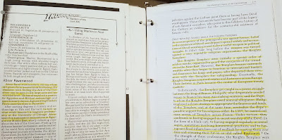
was in 1998. All of my notes and ideas were hand written on index cards. All research
can Xerox copying reference books and articles from magazines. Sure, the
internet existed, but in the way it does now (or even two years later from
1998.) You could tell how fast the college internet was by how quickly the
Netscape Navigator icon was animating.
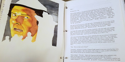
Back in the 1990’s painted covers were more of a thing than
they are today. I have always had my favorite visual storytellers, but even back
then, if they painted stellar covers AND provided the interior art, I held them
to a much loftier ideal. Those select few were ARTISTES! Alex Ross was at the
top of his game, but I always preferred artists like Steve Rude, Tony Harris
and the living legend Brian Stelfreeze.
I think those guys were the cream of the crop (and I still do!) I
figured painting a cover as well as providing the art inside made you a better
artist. I still believe that. In fact, I apply the same attitude to this day to
my own comic Flash Trotter.
It is hard to believe that there was a time that I didn’t
use Adobe Photoshop. I remember not understanding the point of doing tutorials
in high school back in 1996. Tutorials just meant extra work. It wasn’t until
college when I was exposed to people slightly older than me showing me how it
could be used. I didn’t get a computer upgrade until 1999. That computer had
Photoshop. It’s hilarious to see that just the year before, we were taking reference
photos for the covers with actual film! These would have to be lit, photographed
and developed days apart. After that, I was literally cutting and pasting
pictures together like a collage. It feels soooo 20th century.
I had taken pride in the fact that we were making this comic
book for US as FANS. This is the book that we felt Indianan Jones SHOULD be.
The Marvel stuff in the 80’s started out great but were never given the care
that the property deserved (in my humble opinion.) Maybe that was due to low
sales and the book got just the right amount of attention it financially
deserved. Who knows? I know that comic books deal with colorful superheroes and
colorful sci-fi and horror really well. Maybe an adventure comic book is a hard
sell. Whatever the case, I do know that it is sad that the Marvel version died
a slow bimonthly death in between Temple of Doom and Last Crusade; NOT an
ending befitting the greatest adventurer of all time. The Dark Horse versions
were a little better: multi-issue miniseries with painted covers similar to the
movie posters of Drew Struzan. Unfortunately the covers often outshined the
interior art which is something that the glorious Struzan posters were never
able to do to the movies. As fans, Dwain and I were both entertained by Dark
Horse comics’ last entry into the Indiana Jones universe: “Indiana Jones and
the Sargasso Pirates.” One story detail that tickled me in that book was the
opening panel. It featured a picture of an iceberg that was very triangular. As
a fan of the movies, I recognized that this would be the opening shot of the
movie that the Paramount Studios logo would dissolve into. I was so taken by
this opening panel that we opened our story with young Indy in a restaurant spying
on an illegal artifact exchange. The first panel would have been a tiny drawing
of a napkin folded into the shape of the Paramount Logo. Maybe you can see it
in the thumbnails for issue one. I didn’t thumbnail the entire issue, but
thought that laying out most of it would be more advantageous in the long run.
I would redo 70% of it today.
Video complete, and comic book proposal in hand, I set off
to invite my best buds: Dwain (of course) my best friend from “high school”;
Eric, my best friend from middle school: Chuck, my best friend since elementary
school. I had spent my entire life absorbing pop culture story-telling with
these dudes. I had spent my entire adolescence honing my craft as a visual
storyteller. I had spent my entire
summer vacation working on this proposal. This was it: an epic road trip with
my best friends! What could possibly go wrong?
251&275
Saturday, September 1, 2018
Subscribe to:
Comments (Atom)


